Last Updated on by Azib Yaqoob
With recent mobile-first indexing algorithm introduced by Google, it gets quite important to have a well-optimized mobile website. I have covered this topic in my mobile SEO guide. However, in this post, I am going to mention the top Mobile SEO mistakes people make when creating and optimizing mobile site design. These mistakes can leave a negative impact on your overall SEO
These days, most people on an average spend around 5-6 hours a day on mobile. Research has proved that almost 50% of the mobile users close tabs when a website doesn’t respond quickly. If your website is struggling to get traffic through mobile searches, then you must be doing the following mistakes in your mobile SEO.
Here I am listing 5 major mobile SEO mistakes, which may affect your website SEO as well as its design.
1. Extremely Slow Website

Mobile users are more impatient than an average desktop user. The reason is, mobile users are looking for quick information. That’s why it is quite important to speed up your website for mobile users and improve the overall user experience.
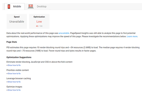
First you should consider checking your mobile website load speed.
If your website is taking more than 2 seconds to load then you need to optimize its speed. Here’s how to speed up your mobile site:
- Compress all the images on your website.
- Consider checking your website for unnecessary CSS/JS files. If your site is loading lots of CSS or JavaScript files, then it may slow down the page load time.
- Use WordPress Caching plugins to speed up your site speed, here is a step by step tutorial to configure W3 Total Cache settings.
2. Cheap Hosting Solutions

If you are looking for a cheapest hosting solution then it won’t help your site in running efficiently. It’s definitely going to save your money but traffic will be affected.
If you want to host huge traffic then always choose reliable hosting service and check the quality as well as reviews of that hosting solution. Always go for high-quality hosting solutions, especially when it’s for an e-commerce site.
The biggest drawback of buying cheapest hosting is that your website has to face lots of security threats and server downtimes.
3. Blocked Files

Never restrict Googlebot to access your Javascript, CSS and image files because it can severely affect SEO rankings.
Googlebot should be able to crawl your site like any other user. If you are not sure about blocked files then check it by accessing your website robot.txt file.
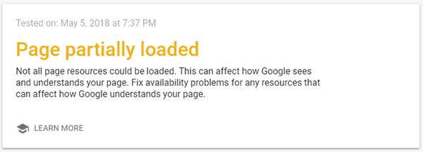
You can use ‘Fetch as Google’ tool from Google Search Console. You will be able to find indexing issues, site usability errors, etc… Don’t forget to check all URLs of your website, both desktop, and mobile versions.
4. Multimedia Content
Of course, multimedia content makes your site look professional and increase user engagement. However using video players, unoptimized gif images, and flash can sometimes don’t work on mobile sites.
If you are going to use multimedia content on your website, then you should test if it is working properly on all the devices. Also, test the speed of your website once you use multimedia content.
A good practice is to use HTML5 tags to include animations and video embeds. HTML5 is supported by all major web browsers and Googlebot can easily crawl this content type. Here is a great tool by Google to create animations in HTML5.
5. Use of Mobile Viewport

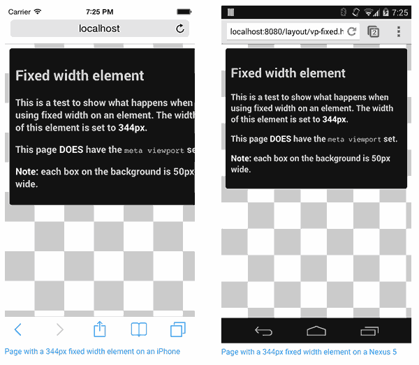
The most common mistake, actually a blunder developer’s do is not to specify the viewports correctly using meta tag.
There are a variety of mobile devices with different specifications and screen sizes. So your website should be responsive across all devices.
For making content responsive across all the devices, a viewport meta tag in the HTML head usually use. Here’s a step by step tutorial on how to make your website content responsive across all the devices.
I have recently compiled a list of best free SEO tools, make sure to check them out to improve your mobile SEO.

Really well thought out post. I appreciate the time you spent on this, and also appreciate an insiders advice.